Generating scientific figures with Python
Generating scientific figures with Matplotlib’s default options is all nice and easy until you need fine-tuning of some small aspect of the plot. Therefore, in pratice I prefer to control all of the figure options myself to create scientific, publication quality figures. Here, I will give an overview on how to do this.
Basic features we require are:
3.25inwidth for single-column figures7.0inwidth for double-column figures12-pointserif font (to match the text size of the main text).pdfformat in order to have the figure as a vector graphic.
Additionally, I recommend:
- size of about
3.25in x 2.5insingle-column figures to get close-to Golden-ratio width-to-height, - carefully selected colormaps (for continuous values, diverging values, or discrete values),
plt.rc('text', usetex=False)for debugging andusetex=Truefor the final figure,- selecting the same filename for the figure as the script name.
Basic single-column figure
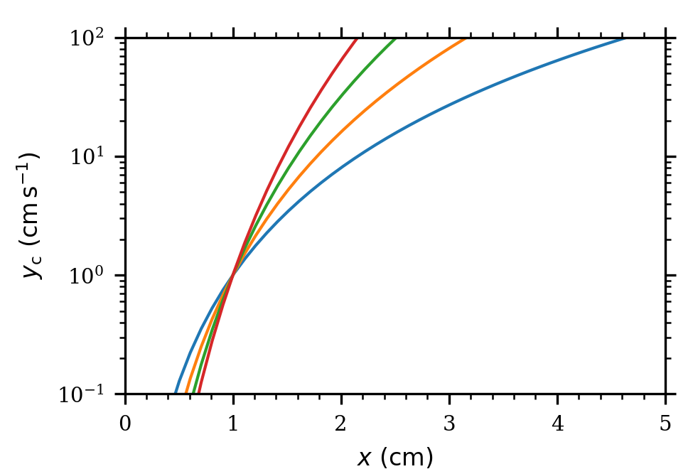
Here is an example figure and a generic python script to create it.
import numpy as np
import sys, os

import matplotlib
import matplotlib.pyplot as plt

#--------------------------------------------------
if __name__ == "__main__":

    fig = plt.figure(1, figsize=(3.25, 2.2)) # single-column figure
    #fig = plt.figure(1, figsize=(7.0,  2.5)) # two-column figure

    # add ticks to both sides
    plt.rc('xtick', top   = True)
    plt.rc('ytick', right = True)

    plt.rc('font',  family='serif',)
    plt.rc('text',  usetex=False)

    # make labels slightly smaller
    plt.rc('xtick', labelsize=7)
    plt.rc('ytick', labelsize=7)
    plt.rc('axes',  labelsize=8)
    plt.rc('legend',  handlelength=4.0)

    # number of rows and columns for the figure
    nrow_fig = 1
    ncol_fig = 1

    gs = plt.GridSpec(nrow_fig, ncol_fig)
    gs.update(wspace = 0.25)
    gs.update(hspace = 0.35)

    axs = np.empty( (nrow_fig,ncol_fig), dtype=object)

    for j in range(ncol_fig):
        for i in range(nrow_fig):
            axs[i,j] = plt.subplot(gs[i,j])
            axs[i,j].minorticks_on()

    axs[0,0].set_xlabel(r"$x~(\mathrm{cm})$")
    axs[0,0].set_ylabel(r"$y_\mathrm{c}~(\mathrm{cm}\,\mathrm{s}^{-1})$")

    axs[0,0].set_xlim((0, 5))
    axs[0,0].set_ylim((1e-1, 1e2))

    #axs[0,0].set_xscale('log')
    axs[0,0].set_yscale('log')

    # optional colorbar
    #tmin = 0.0
    #tmax = 10.0
    #norm = matplotlib.colors.Normalize(vmin=tmin, vmax=tmax)
    #cmap = matplotlib.colormaps['turbo_r']


    #--------------------------------------------------
    # figure

    for i, a in enumerate([3,4,5,6]):
        col = 'C' + str(i)

        xx = np.linspace(0, 10, 100)
        yy = xx**a

        axs[0,0].plot(xx, yy,
                      color=col,
                      alpha = 1.0,
                      lw = 1.0,
                      #drawstyle='steps-pre',
                      linestyle='solid',
                      )


    #--------------------------------------------------
    # save

    # control these (in units of [0,1]) to position the figure
    axleft    = 0.18
    axbottom  = 0.16
    axright   = 0.96
    axtop     = 0.92

    #--------------------------------------------------
    if False: # optional colorbar
        pos1 = axs[0,0].get_position()
        axwidth  = axright - axleft
        axheight = (axtop - axbottom)*0.03
        axpad = 0.02
        cax = fig.add_axes([axleft, axtop + axpad, axwidth, axheight])

        cb1 = matplotlib.colorbar.ColorbarBase(
                cax,
                cmap=cmap,
                norm=norm,
                orientation='horizontal',
                ticklocation='top')
        cb1.set_label(r'power-law index $a$')
    #--------------------------------------------------

    fig.subplots_adjust(left=axleft, bottom=axbottom, right=axright, top=axtop)

    fname = 'fig.pdf'
    plt.savefig(fname)

    fname = 'fig.png'
    plt.savefig(fname, dpi=300)
Multi-panel figures
Sometimes more than one panel is needed in the figure. Multiple panels are easily controlled by defining the nrow_fig and ncol_fig variables as
    # ...
    nrow_fig = 2
    ncol_fig = 2

    gs = plt.GridSpec(nrow_fig, ncol_fig)

    # control these to adjust the space between the panels.
    gs.update(wspace = 0.25)
    gs.update(hspace = 0.35)

    # ...
The panels are accessed using axs[row, col] syntax as
    # ...
        axs[0,0].plot(xx, yy) # top left
        axs[0,1].plot(xx, yy) # top right

        axs[1,0].plot(xx, yy) # bottom left
        axs[1,1].plot(xx, yy) # bottom right
    # ...
Figures with a colorbar
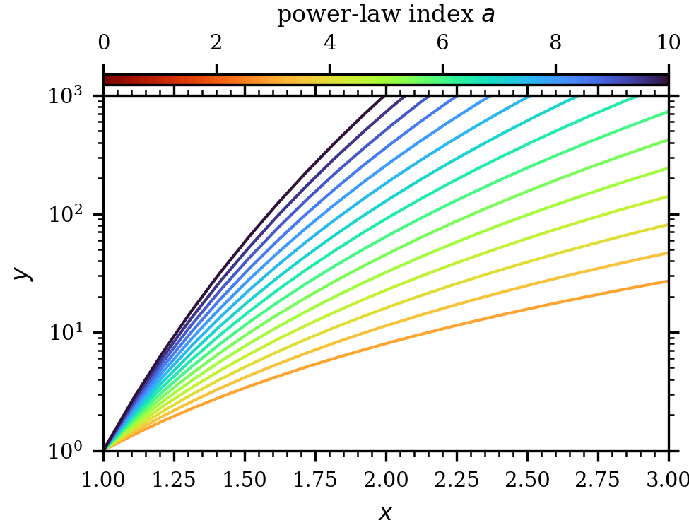
Colorbar placement is also best done manually. First, we need norm and cmap objects
    vmin = 0.0 # minimum color
    vmax = 10.0 # maximum color
    norm = matplotlib.colors.Normalize(vmin=vmin, vmax=vmax) # linear scale
    #norm = matplotlib.colors.LogNorm(vmin=vmin, vmax=vmax) # log scale
    cmap = matplotlib.colormaps['turbo_r']
Then, the color can be obtained dynamically as
    for i, a in enumerate(np.linspace(3, 10, 15)):
        col = cmap(norm(a))
        xx = np.linspace(0, 10, 100)
        yy = xx**a
Here norm(x) scales the value from an interval of [vmin,vmax] to [0,1]. This value is then passed to cmap to get the corresponding color.
The colorbar is created as
    axleft    = 0.15
    axbottom  = 0.15
    axright   = 0.97
    axtop     = 0.82

    if True:
        pos1 = axs[0,0].get_position()
        axwidth  = axright - axleft
        axheight = (axtop - axbottom)*0.03
        axpad = 0.02
        cax = fig.add_axes([axleft, axtop + axpad, axwidth, axheight])

        cb1 = matplotlib.colorbar.ColorbarBase(
                cax,
                cmap=cmap,
                norm=norm,
                orientation='horizontal',
                ticklocation='top')
        cb1.set_label(r'power-law index $a$')

